Welcome back to the great uniform countdown of 2023, brought to you this time by my 12 hour long anxiety attack I’ve been rolling through today. I’m sure you guys are equally as anxious to see the next 20 teams on the list so lets dive in!
80. Philadelphia Eagles
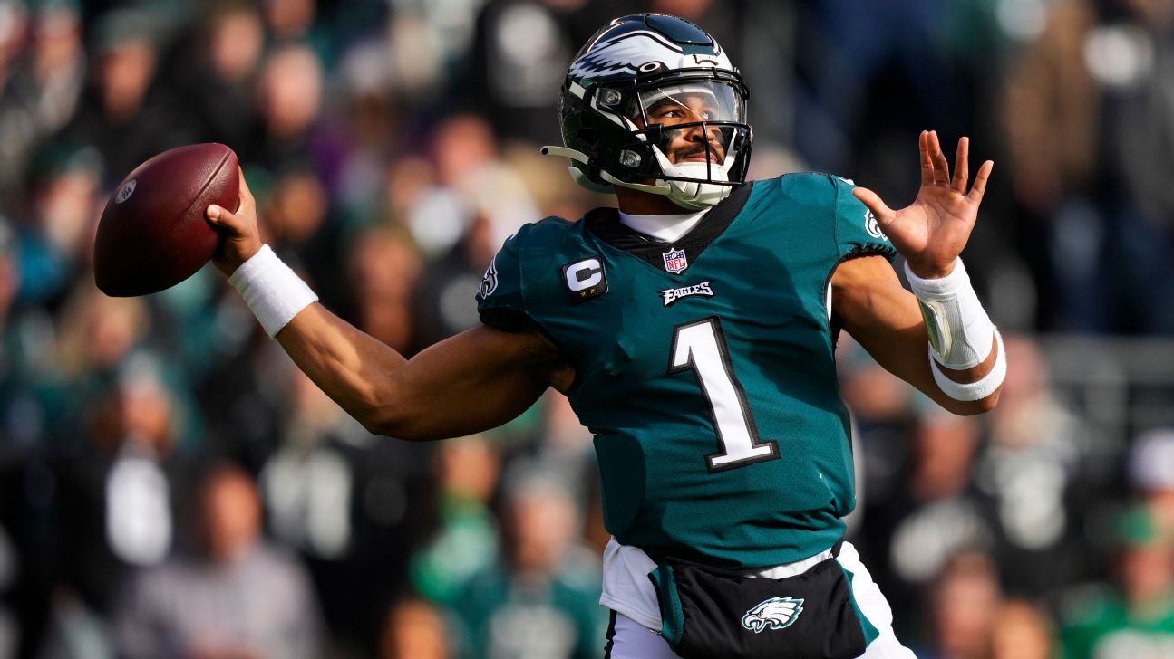
At time of writing this, the Eagle’s throwback uniforms have not dropped, so I consider their current set up to be rather average and is creeping into dated territory. The color of green they have is just too dark and it tends to mold together with the black accents. Their helmet and the wings really do boost them up in the rankings quite a bit, as I am a sucker for any creative styling to a helmet where it’s not just a logo slapped on it. A strange element to this helmet, however, is how the white line outlining the wings does not extend across the front bumper. It’s just a gap. you’re a professional team and you have this huge flaw just sitting right there? Why on earth do they not do anything about this? Anyways. Their black alternate helmets are cool with the shiny flakes in the paintjob. Nice job there.
79. Memphis Grizzlies

The Grizzlies have a boring look on first glance with some nice touches around the necklines, a nod to their PNW past. That said, the various blues that they use dont work all that well for me and the look overall falls flat. The court they play on doesnt help things, as it looks as nondescript as your local YMCA. Their throwbacks are primo, and the darker alternate with the brighter yellow accents looks really nice.
/cdn.vox-cdn.com/uploads/chorus_image/image/70344048/usa_today_17437447.0.jpg)
78. Tampa Bay Lightning
Bright blue and white. Simple, effective. Not much to complain about here. Always reminds me of the Rockford Lightning, though (RIP)
77. Tennessee Titans

The Titans came out with a redesign a few years back and the results are ‘better but still mediocre…but still better’. They’re like a higher quality XFL team, but its not like they have some big historic look that they are moving away from. I like the sword down the top of their helmet and on the shoulders, the red accents give it a nice pop. Speaking of history though…whats with them trotting out the Oilers throwbacks this year? What a slap in the face to fans from Houston. Hey we stole your team, here’s a little reminder of that.
76. Minnesota Twins

The Twins have been bopping around rebrands since the Metrodome days and I feel like they’ve landed on a …different way to use their color scheme with their current setup. It’s simpler, utilizes the Twin Cities name nicely on the cream alternate, but falls short when it comes to the North Star M hat and the underwhelming dark blue Minnesota jersey. The hat looks too much like the Marlins logo and the jersey / numbers just feel too modern for their own good. I’m giving them the benefit of the doubt that they will bring the throwback uniform out this year as well, as those baby blues are flamin hot.
75. Anaheim Angels
/cdn.vox-cdn.com/uploads/chorus_image/image/59883917/821307532.jpg.0.jpg)
The Angels have kept basically the same red & white look since their rally monkey 2002 World Series Championship and generally speaking, it has been a look that has stood the test of time. They had a little misstep in there with the vest jerseys a few years back, but hey, it happened to the best of them! Their current City edition jersey looks great with the more sandy color looks fantastic as well. Have I ever mentioned how I live 5 minutes from Angel’s stadium? pretty neat.
74. Brooklyn Nets
/cdn.vox-cdn.com/uploads/chorus_image/image/72394058/1251965662.0.jpg)
The Nets have had some good looks since moving to NYC, and overall I like the rebranded black and white look they’ve put on the court. Their collaboration with local artists is a nice touch, although it can produce some clunkers. The tye-dye jersey they wore these past couple years is fantastic.
/cdn.vox-cdn.com/uploads/chorus_image/image/68680009/1296761956.0.jpg)
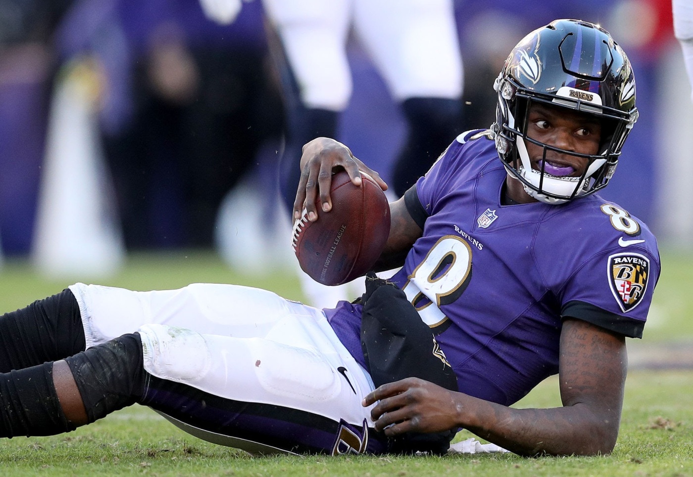
73. Baltimore Ravens
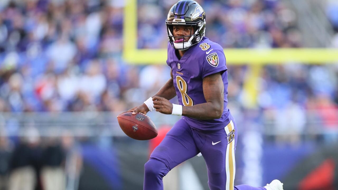
This is a case of a cool player making the jersey look cool. Lamar Jackson has breathed new life into Baltimore’s look just by being so sweet to watch. The dark purple and black can get a little muddy together on the field, but the brighter shaded color rush with the gold numbers is a fantastic addition to the wardrobe.
72. Pittsburgh Penguins
/cdn.vox-cdn.com/uploads/chorus_image/image/66820197/1204962613.jpg.0.jpg)
Pens look alright. Good colors. Silly logo of a penguin playing hockey. They’re a classic.
71. Cleveland Browns

The Browns! They played with some new looks that in hindsight, were bad. The BROWNS down the side was bad. the CLEVELAND across the chest was bad. The color rush unis….pretty good! They’ve fixed it with this clean getup now, going to a more traditional look, but with modern touches like the number font and the satin orange helmets.
70. San Jose Sharks

There’s so many teams on this list that came out with a wild n crazy look as an expansion team in the 90s, then dropped it for something more traditional, then will occasionally bring the retro colors back out and get the fans just GUSHING over them. Not the Sharks! They followed that playbook but just stuck it out with their dated look until it looked cool again. We have come full circle. Their teal helmets are a nice touch.
69. Atlanta Braves
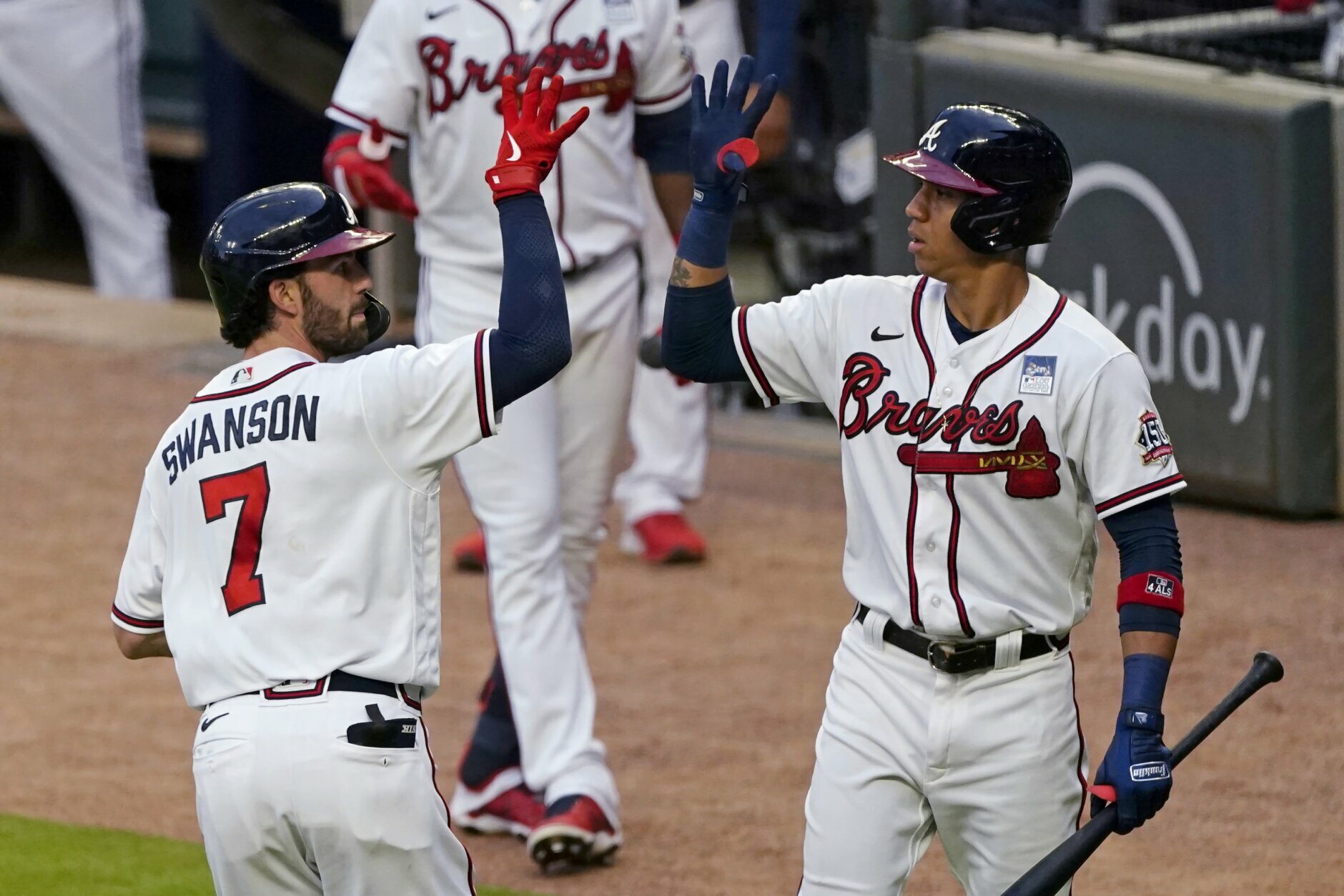
Atlanta’s got some CLEAN uniforms. The home white seems just a little brighter than the rest of the league and their throwbacks are fantastic. They lose points with the away grays. Something about them seems more drab than it should. But as I just mentioned, the throwback unis tend to even out the score.

68. Kansas City Chiefs
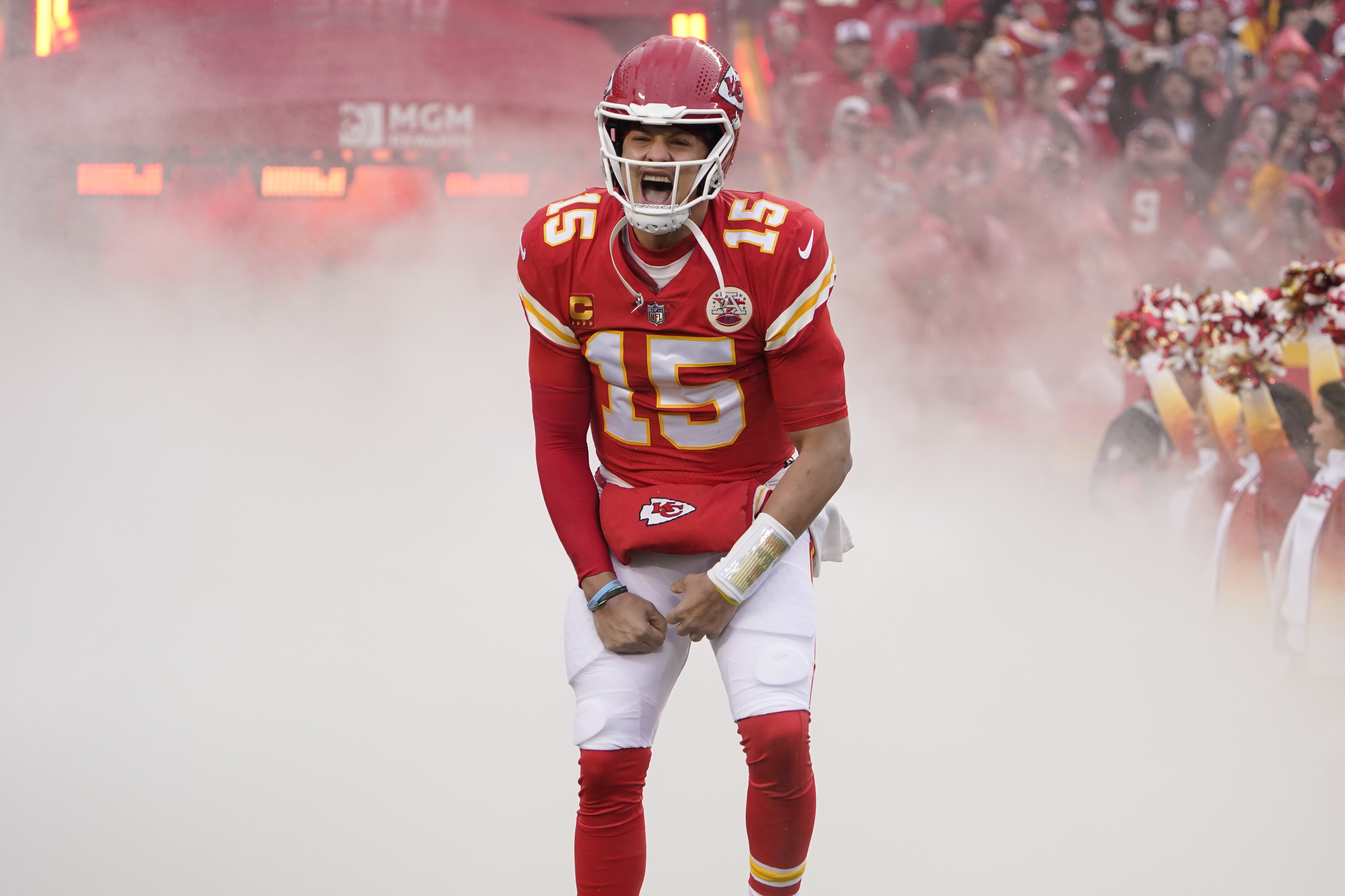
Mahomes, Kelce, Hill, and Mattheiu have made this ketchup and mustard uniform look swaggy. That probably says more about them than the uniform itself. All Im saying is if they trot out some journeyman white Brad Johnson lookin quarterback and go 8-8, they’re looking at a much lower ranking. What do I do with that info? I dont know.
67. Los Angeles Clippers
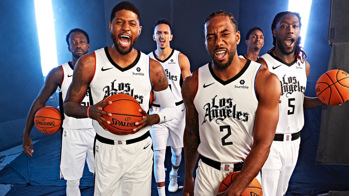
The Clips have had some really good colors with the red white and blue and could really parlay their look with the local Dodgers fandom but recently they forced black into their colorway, along with the Mister Cartoon designed old english font. Love the look without the black, but really poor execution on that variation. I think theyre trying too hard to grab a hispanic market that is dug in deep in the Lakers fandom. They should just move to Orange County. We’d welcome them with open arms. That’s a conversation for another day. Anyways, dont these look better?:

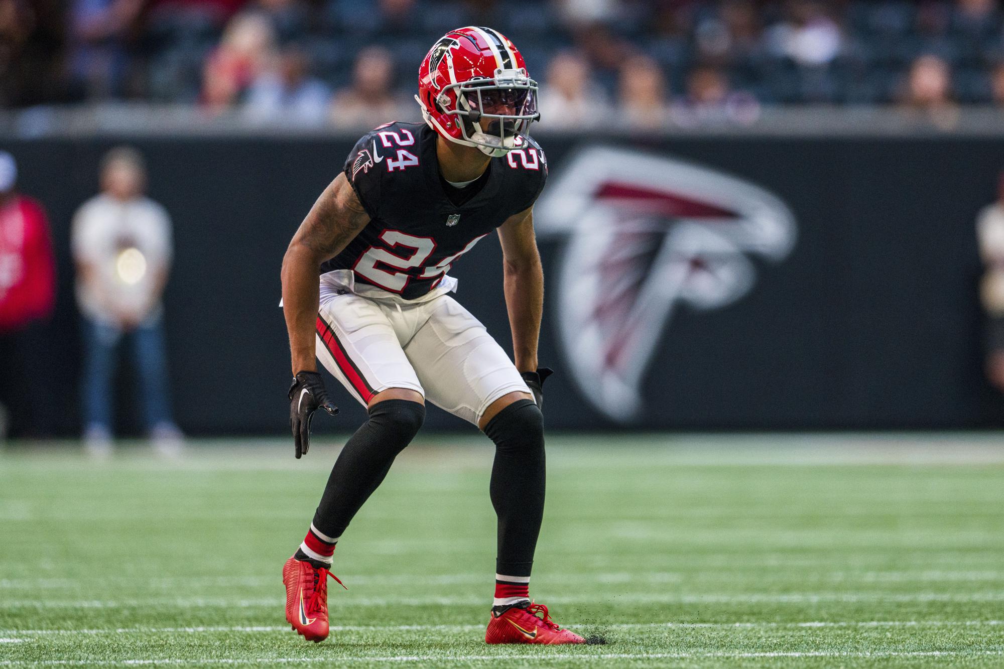
66. Atlanta Falcons

The Falcons rebranded recently away from the Reebok template to a much simpler but still unique look designed by Nike. I really have no major complaints, although the gradient uni set is just wild and probably shouldnt exist as it’s going to be VERY dated within a year or two. it’s not as bad as the old Jaguar helmets, but it’s a little goofy looking for an NFL team. The ATL on the front is a little odd, but I generally dont have an issue with it. The numbers are bright and pop off the uni, the satin black helmets look good. They’re a good looking squad down there. Also that throwback set is beautiful.
65. Seattle Kraken
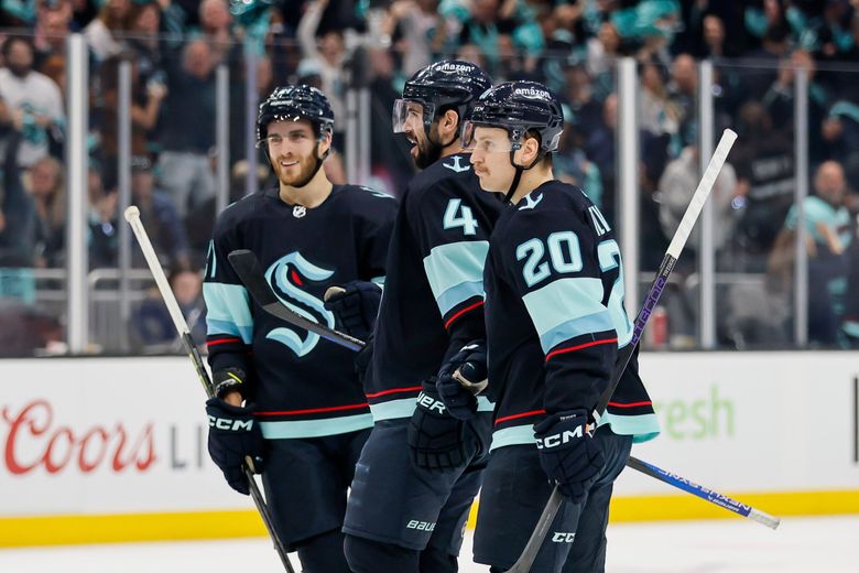
As a recent expansion franchise, the Seattle Kraken didnt sit on their hands with their design and went with some bold colors, with a navy blue and teal, giving it a very aquatic look (fitting) while also somewhat matching the local baseball team. The logo doesnt do it for me, but maybe it’ll just take time to grow on me. It’s a good start.
64. Denver Broncos

The Broncos have had this rebranded look since Moses wore short pants and are probably due for a bigger refresh than just wearing orange all the time, BUT that being said the look has never felt all that old. Nike knocked it out of the park and the staying power of the modern redesign is truly something worth giving a thumbs up to. Their modern retro color rush from a couple years go was FANTASTIC. Bring er back!
63. Minnesota Wild
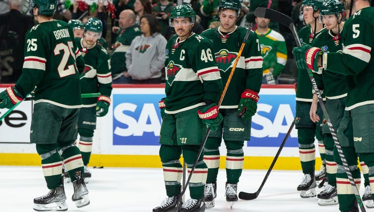
If REI had a hockey team. That being said, I do really like REI.
62. Texas Rangers
:no_upscale()/cloudfront-us-east-1.images.arcpublishing.com/dmn/5YNAJCLJ4FDCRGXYJL7IGVHKRQ.jpg)
Beautiful red white and blue uniforms. I often forget they exist as a team though. The newest addition, the baby blues, should help me to remember them though.
61. Houston Astros
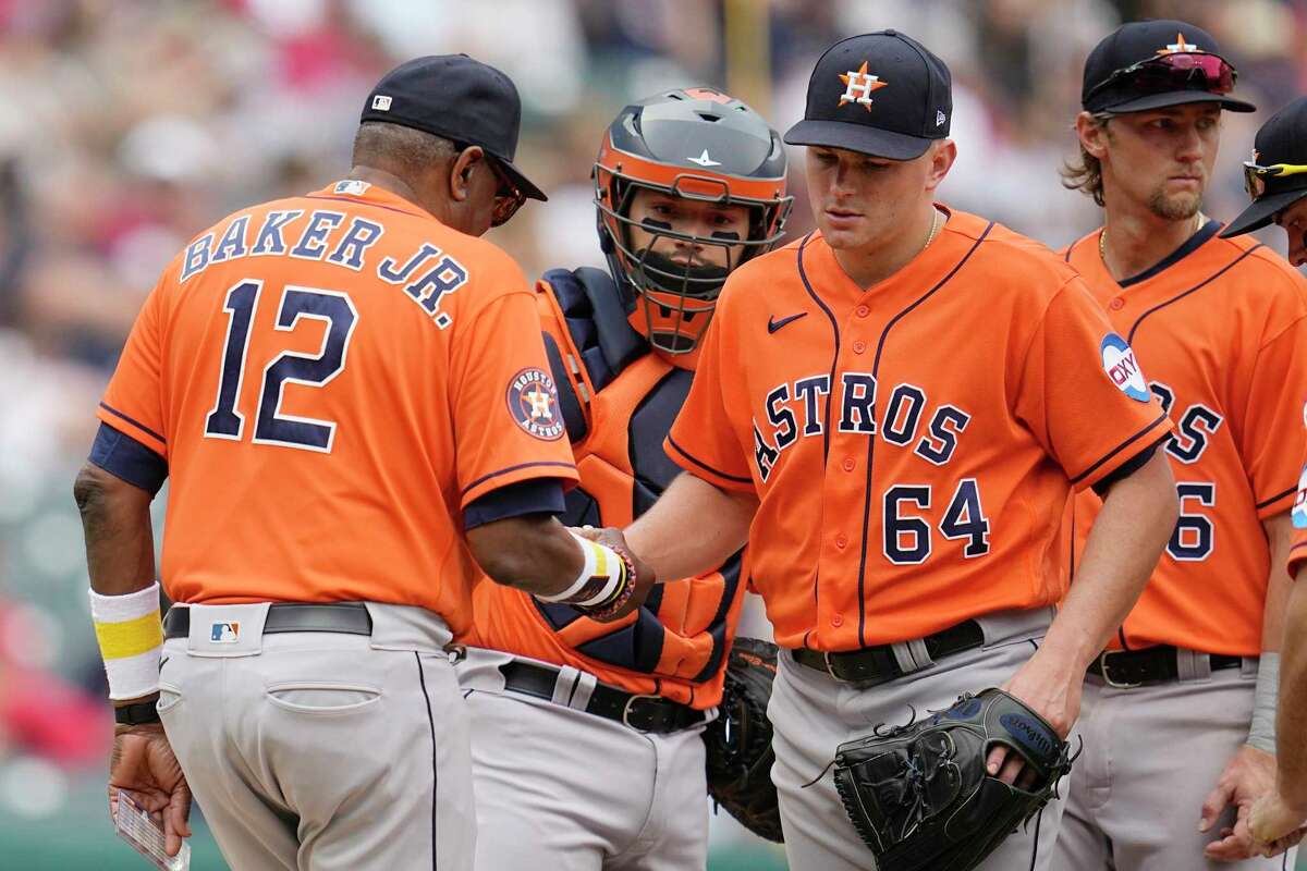
Another Texas baseball team here. I REALLY struggled with who goes in this slot because we’ve now entered the territory of uniforms that I just genuinely like. The Astros newest look is good not great and kind of boring with great colors. That being said, if I was ranking alternate/throwback jerseys alone, they might be #1, because the tequila sunrise jersey is just fantastic. Maybe I just am fatigued by seeing them in the World Series so much that Im bored with the current look. Good problem to have, honestly.
Onwards and upwards to the next 20 in the rankings!! We’re getting into the good ones, and I’m still switching things around to bring you the most accurate subjective list that can be put together.

Leave a comment